

Just a shout-out to everyone, please tune in to http://podhammer.net/ and do drop a vote or two to support this superb podcast. Paced well with solid advise (Dave’s funny too), this is well worth a listen!
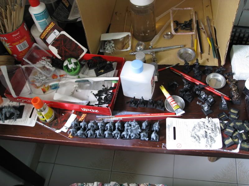
Anyway, the dude thats almost complete is Grombrindal aka the White Dwarf himself, whereas the dudes around him are what-will-be-his Hammerers. I'm still a little torn about how to do their beards though. If you look at the picture, the guy left of Grombrindal in the picture has a lighter beard; the guy to the right has a black-shaded beard, while the champion right at the end of the picture has a dark grey-shaded beard. I have no idea which looks better.....Black looks best on photos I have to admit, but it looks kinda weird in real life >.<
Not to mention black-shading is rather extreme.
As for my army plans....
Right now what I have would be a single Warrior box which will be my 16 hammerers, a Rune Priest and Grombrindal (aka Thane no.1, where the BfSP Thane will be Thane no.2). I'm already getting 2 BfSP boxes with my cousin, so that means I'd probably grab a battalion for an extra bunch of warriors to make into my longbeards (I'd probably want 20 men, which is bigger than the normal box of 16 models; the battalion on the other hand gives 24 men which is more than enough) and I really want that organ gun. Doing the math I'm gonna spend just a bit for the Thunderer/Quareller figures which I don't really need, but I figured some day I might just kick myself for not having a squad of Quarellers, so I might as well get them. Plus the extras will make good squad fillers to replace the Standard Bearer and Champion Thunderer in the BfSP Thunderer squad which I probably don't plan to use; basically just for WYSIWYG reasons.
Then I'd probably get an Anvil of Doom, because its so cool :P
Projected expenditure? One Anvil, on Battalion and whatever I owe my cousin for the BfSP; basically, the price of a single BfSP box. RM650 or so I guess - hefty, but when you've been playing miniatures for as long as the both of us, its almost like RM650 is "cheap" for a full 2000 point army, although we will all miss the days multipiece plastic regiments/squads were RM88 per box (40 sing) ten years ago :(
So thats all from me for now, happy gaming/painting/studying/working XD
Had the following game on 29th June 2008:
1. Sam + Ray (Empire + High Elves)
2. Daniel + Tet Hong (Dwarf + Dark Elves)
It was our proverbial return to Fantasy. The whole group of us used to play at my place but have since gone off to do our own things but have decided to return! Daniel and I fielded 2K while Sam and Tet Hong did 1K each. With the dwarves, I find that Dan likes to play a very static army. With two big blocks of infantry hanging back, it was kind of boring. However, Tet Hong was constantly harassing our flanks and that made the game more interesting. I doubt I could ever do a Dwarf army.
Tet Hong was easily dealt with, having wiped him out early in the game. His trick of drawing a charge failed when he flee the Dark Riders into impassable terrain (he didn’t check and in the new ed, you lose the unit if they flee through impassable or enemy units).
Now the key challenge was facing a crossbow, organ gun and 2 Bolt Throwers in an open field devoid of terrain. Firstly, we had a very narrow corridor on our right flank, forcing us to field our infantry on the middle. The problem with multiplayer games is that you tend to just deploy without really thinking of the repercussions. Lesson learnt, I will want some control over deployment of the terrain. This is just so that the terrain is well scattered and not open fields of death like our game (very boring and unfair to my side). Ideally 6 terrain pieces, nothing more than 12” wide with each getting 1 terrain piece each. That will give both sides ample room for controlling the terrain and nerfing armies that depend entirely on open terrain to function.
With force composition, I found the 5 models wide shocking. Now my Silver Helms will have to work in a unit of 9 at least to get the additional rank bonus. I fielded 8…WTF! Also, Spearmen will have to come in a unit of 15 minimum or 20 if I wanted to benefit from having the rank bonus of +2. Striking first, this should help. Sword Masters with two attacks each are superb even receiving the charge. It’s almost similar to me charging! The problem with the rule is that it allows me to play quite defensively. I am going to write a defensive list to take advantage of this rule. More Lothern Sea Guard and RBT’s, Mages and rings!
Color temperature is also important. Try to imagine if different colors were a different temperature on a thermometer:
Blue, Purple, Blue Green and Dark Green are all "Cool" colors that are usually described as "relaxed, calming, serene".. if you're a hippie. The "Warm" colors are Orange, Red, and bright Magenta which all "excite and aggravate" us.. again, if you were a hippie. Yellow and Green being in the middle are neutral to a point, and so is brown. These two could be used with about anything and it would fit in if it was in the right place. Now, the important thing to remember in Warm and Cool colors is that in shading, Cool colors look better, and in highlighting, Warm colors do better. Thus, if you were highlighting Green, you would use Yellow for a highlight. Some colors do not do well with Black and White, so this is the only way some of them will look good. See Tints & Shades Below..
No, they're not just car accessories, Tints and Shades are names for colors mixed with White and Black respectively. These are good for contrast, but some colors are just horrid when mixed with White or Black.. Look at this Color Wheel (and I apologize about the inner ring next to black, human mind is not as precise as it should be.. also note white circles would be there, if this was not a white surface):
As you can see, yellow gets this ugly olive color that would not be good if you were doing something yellow that is not camouflage. As stated above, you could use green for a shade or add purple to make a better shade. White also makes Red pink, which would not be used on fire. You would either use Orange or a brighter Magenta to highlight it.
Notice how the Warmer Colors stick out more in the Shades than the Cool colors? That's not a coincidence. It's strange, but the human eye see more of Green than any other color, but some colors like Yellow just appear too bright to us that we sometimes mistake a bright yellow for a dark or faded white..
Now, Earth Tones are not exclusively for bases, as the name implies. Rather, any color you add grey or a dark color added to a brighter color, you get an Earth Tone. Now, these are the most natural looking colors there are and Vallejo carries them almost exclusively, and it's about all I ever use! Compare the bright color wheel on the left with the one that has had a brownish grey added to it:
Notice how the second one looks a lot duller a brown in comparison to the brighter colors on the left. These earth colors do not have to be flat brown, but some colors do look brownish, but they should be considered more of that color as an earth tone than brown... To explain, look below:
Notice that the first color is what I call a "true" brown, while the next color looks like a yellow, then next an orange, and the last a red. However, you note that they are not as bright as they should be. "Should be" being a relative term, because colors are that dingy in real life. Though it is good in the mini world to use bright colors, natural colors also have a good effect.
One good thing about earth tones is besides looking more natural, they also look better when put next to bright colors and metallics. Again, this helps with contrast and makes areas stand out more. Once again, Sturmhalo's Harbinger is a good example of this:
All of the major colors are dingy, making them earth tones, while the metallics shine because of their natural reflective qualities.
Now, some people can be misled by colors very easily. Look below and see what's wrong:
No, that statement is true. Not all of that sentence is Pink. It looks like Pink to you, although it looks a bit transparent. But then stop and think: the Pink on the White side is Pink, and the other letter are different. That's because they're PURPLE! And as we learned above, Red and Blue make Purple. The optical effect fakes you out into seeing that the letters are transparent. If the blue was not there, it would be a part purple, part pink sentence. This can be used all over that place. If blood was spattered across something painted, you could mix it in to make a transparent effect, even though it would be different colors.
Another tip about White and Black: When painting them, remember to save White for the Whitest of the White that every Whited and Black for the Shadows of the Black object in a room at night. Human eyes can see differences in color but our brain has been taught to call things when we were growing up. The best solution to this is to use an off White Grey or Beige for White things and use White as a final and absolute highlight. By the Same token, Black should only be used as a shadow on a black, matte object and the rest should be basecoated with a slight difference in a Dark Grey or even Blue. It should also be noted that all shadows are not Black. In the art world, things just have darker colors for shadows, much like using a cooler color.
Remember to keep the figure cohesive in colors. By that I mean if you use dark colors, keep it kinda like that. A giant patch of ultra bright Yellow or Orange on a dark Blue mini looks loud and garish looking. If you really want to use Yellow, use a darker kind of Yellow, like that mustard brown you get with Purple and Yellow.. This is just because you have to remember that the whole figure is in the same light, to unless there is a flashlight on just that part, the whole figure would have the same variation in colors.
Once again, these are the basic "rules" that you should have in the back of your head. You do not need to follow thing to the letter. I will not force you to put green in a red miniature, but you may think of what else you could use. Sometimes you may find it to your style to throw out the rules and do as you please, but it is better to learn the fundementals first. Have fun, and no more purple and neon green color schemes everybody!